

Breaking the Law: How vaccines broke Farr's Law
Have the vaccines destroyed the basic laws of epidemiology?

The spread of viral diseases follows relatively simple rules.
If you graph the number of cases per day (or hospitalizations or deaths or ….) you will see something very close to a bell curve.
This has been known since the 1840s, when it was shown by Dr. William Farr that a smallpox epidemic followed a simple mathematical curve.
Cases increased exponentially and then fell off symmetrically; essentially a bell curve. Not surprisingly, this became known as Farr’s Law.

Farr’s law does a pretty good job describing the changing case numbers for the vast majority of diseases.
Because scientists can never leave well enough alone, they kept making small adjustments and found dozens of little tweaks that would fit the data better for some infections. The one that fits COVID best is called the Gompertz function.
The Gompertz curve is similar to the bell curve above, but has a few minor differences. It takes a bit of time to get going and then rises even more quickly; it also takes a little longer for cases to diminish.

For all of 2020 (before vaccines), virtually all COVID case numbers, hospital censuses, and deaths per day (worldwide; big and small countries or states alike) followed Farr’s Law and the Gompertz curve (almost like it was the law or something).
[These equations have also been used to model future cases; sometimes to great effect, but most often wildly overestimating - but always following a Gompertz function/Farr’s Law. ]
Just one example of their use in modeling is seen here:

Despite huge differences in areas like population size, average age, obesity rates, and latitude, the first two COVID surges in the USA and everywhere else around the world followed these mathematical norms. Because every location and every surge followed Farr’s Law- I could almost pick any chart from the summer 2020 or winter 20/21 surges at random. Because I am most familiar with Arizona, here are cases per day from my home state:

I created a generic Gomperz curve (red, yellow, & green) and overlaid it on the actual data (blue). The red (summer 2020) and yellow (winter 2020/21) curves are identical Gompertz curves- I just scaled the yellow one higher and wider (same aspect ratio) to fit the size of the spike. [The weird divot in the second curve is the result of Christmas reporting lag.] Note that the first two ‘waves’ follow the Gopertz curve almost exactly. Again… before vaccines started being stuck into arms, all these curves matched what was expected almost perfectly.
Then, comes summer 2021….. and nothing is the same.
In vaccinated areas, COVID spikes no longer follow the Gompertz curve or Farr’s Law. They have at least one of these three problems (and usually all three):
1) wrong timing (ruined seasonality),
2) wrong size (much larger than expected given the levels of natural immunity and vaccinations), and
3) wrong shape (cases stay high after the peak).
Looking harder at the Arizona data, you can see that the third wave, which came after ~55% of the population is vaccinated, starts in August 2021. This is late. Almost 2 months later than the summer 2020 surge in cases. [In fact, seasonality - which had nearly perfectly predicted COVID cases - fell apart nationwide in the summer of 2021…. but that is another post entirely.]
When we zoom in on the third wave, starting in August 2021, you can clearly see it looks weird. It kinda starts out as expected, but then grows more slowly than expected, and eventually plateaus instead of dropping steadily along the predicted Gompertz curve:

What happened? Vaccines happened.
Sure, the delta variant became dominant over the summer of 2021 - but areas dominated by delta but without massive vaccine campaigns (e.g., India and South America and Africa) followed Farr’s Law exactly as before.
So, the abnormal curve shapes are not caused by the delta variant and the only other thing I am aware of that that changed during this period was the introduction of vaccines.
Simply put - the vaccines destroyed the natural laws and normal dynamics of viral spread.
The United Kingdom is another prime example of this breaking of Farr’s Law. Like most places, they have had three waves.

The first two spikes look totally normal and follow seasonality predictions (even the bump in the second wave), then they initiate one of the earliest and largest vaccine programs in the world starting in the spring of 2021. By late summer, they had vaccinated well over 80% of their eligible adult population.
Behold what they are going through now:
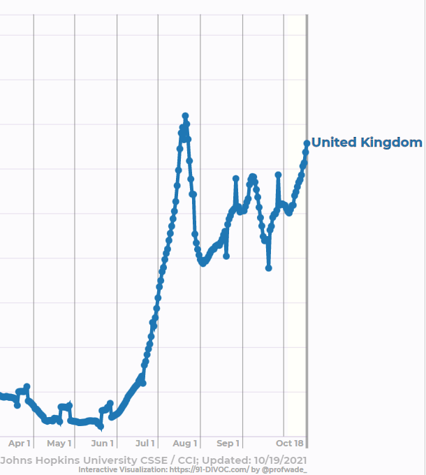
Here we can see all three problems.
1) Wrong timing: it is wildly unusual because it starts in mid-summer while seasonality for this latitude predicts no significant surge until October - three to four months early!
2) Wrong size: This surge is nearly as big as their winter 20/21 spike… but with (supposedly) fewer than one-fifth the number of possible hosts. If vaccines worked as advertised, this would not be possible.
3) Wrong shape: While the initial rise in cases looks ‘right’, what happens after the peak is anything but normal.
Instead of dropping steadily back down to baseline, the cases surge upwards again. And then again.
And again.
Very similar to the plateau seen in Arizona cases.
Remember, all this is happening in a country with over 80% of its adult population ‘fully vaccinated’.
Israel’s curve shapes look reasonably Gompertz-like, but instead of each successive wave getting smaller, Israel’s surges are getting larger and larger! And it’s third spike - after the vaccines - is the largest of all. Again, it should not be possible for a country with over 75% of eligible adults fully vaccinated.

It may even be that vaccinations have created a COVID problem where none existed before. Mongolia and Singapore went from statistically zero cases before vaccines to huge and unnatural spikes (each now has twice as many active cases per capita as the United States!).

The correlation between the abnormal spikes/curves and the onset of vaccination is striking.
For example, Mongolia. After having nearly zero COVID cases for the first 14 months of the pandemic, cases started going up almost exactly 21 days after they started a huge vaccination campaign. And just kept going up. And up.

The correlation is astonishing - but how can you get to causation?
I mean, how could a vaccine cause cases????
I will likely detail a potential answer in a future post, but the short answer is: these are NOT vaccines.
They are genetic prophylactic therapies - and they create a whole host of unexpected problems.
They are drugs - and they have side effects like drugs, not like vaccines.
There are major two issues: 1) they make recipients more susceptible to the virus for the first week or two and 2) they fade over time and after 4-6 months again make the patients more likely to be infected.
How bad will it get?
How much will this affect the pandemic??
Certainly nobody predicted the kinds of disruptions to Farr’s Law that have already occurred - so they cannot predict what else will happen.
We will have to wait and see.
And hope.
All these increased numbers are for *cases*. The numbers for hospitalization and deaths are lower than previous spikes. It appears these gene therapies are effective at reducing those....
A month later - and all of these areas continue to look 'wrong'. AZ is probably just starting its winter spike - but never really ended its summer/fall spike. Same in the UK.